Auto Flow View draws a visual dependency graph of TestNG flows — reading @Test methods and their dependsOnMethods relationships, then layering tests by depth to expose parallel groups and inherited steps. It shipped on two IDE platforms.
Not yet open-sourced. Source isn’t public yet. There’s a design write-up in Visualizing TestNG flows across two IDEs.
The problem
Large TestNG suites encode their execution order implicitly through dependsOnMethods.
Understanding “what runs before what” means tracing annotations by hand. Auto Flow View turns that into a diagram you can read at a glance.
Architecture
The clever part is that the flow model is the portable core — a small, framework-neutral shape (tests as nodes, dependsOnMethods as edges) that both platforms build and the graph view renders. Only the front-end that reads the Java differs per IDE.
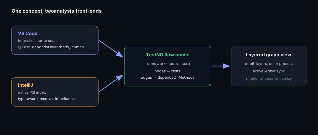
- VS Code uses heuristic source analysis — scanning for
@Test,dependsOnMethods,@BeforeMethod/@AfterMethod, groups, and method names. There’s no Java index to lean on, so a text pass gets a correct graph for the overwhelming majority of suites at near-zero cost. - IntelliJ uses the platform’s PSI index, which already exists — so type-aware, inheritance-resolving analysis is both cheaper and more accurate there.
Same feature, opposite right answer, because the platform’s starting point is different.
What the panel looks like
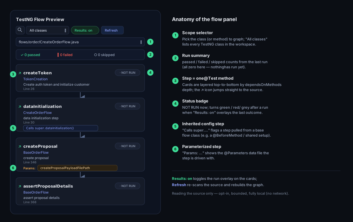
The graph renders as a scrollable column of step cards in the editor’s side panel — one card per @Test method, laid out top-to-bottom in dependsOnMethods order and joined by arrows.
Each card carries everything you need to read the flow at a glance: the method name (with a jump-to-source link), its declaring class, the @Test description, the source line, and a status badge.
Inherited setup steps are flagged with Calls super.…, and parameterized steps show their Params data file.
Technical explanation
The feature that made it click was layering the last run’s results onto the cards: the Results: on toggle colors each status badge by pass/fail/skip, updates the summary banner (passed / failed / skipped), and outlines failed cards — turning “see the scenario” into “see the scenario and how it did.”
The design rule was that the overlay must never tax the normal path: report scanning runs only on demand, de-dupes files, caps how many it scans, skips oversized files, guards against overlapping scans, and aggregates parameterized rows and retries per class::method. Because the graph and the outcomes are separate data, analysis can run without a single test result, and the overlay can attach later without touching the graph builder. Everything is opt-in, bounded, and local-only — no network.