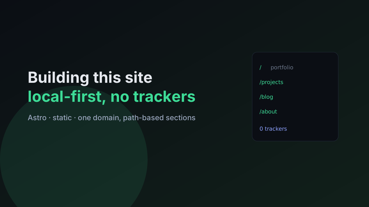
This post is delightfully meta: it’s the story of building the site you’re reading it on. It went from “I want a blog” to a full personal site, and the decisions along the way are a decent case study in starting small and letting requirements reshape the plan.
Choosing the stack: why Astro
I weighed three options the way I weigh most stack choices — against what the thing actually needs:
| Option | Pros | Cons | Fit |
|---|---|---|---|
| Plain HTML/CSS/JS | Zero build, deploys anywhere, nothing to maintain | Repetition, no components | Great for a tiny static site |
| React + Vite (SPA) | Components, rich interactivity | Build to maintain, heavier JS, weaker default SEO | Overkill for content |
| Astro | Component authoring, near-zero JS by default, great SEO/perf | A build step | Chosen |
A personal site is content-first: it should load instantly, rank well, and not ship a framework’s worth of JavaScript to render an article. Astro’s “static by default, ship almost no JS” model fit exactly. The only client-side scripts here are tiny inline ones (theme toggle, mobile nav, blog search, the table-of-contents scroll-spy).
Paths over subdomains
Early on I considered blog., projects., about. subdomains. I went with one domain and path-based sections (/blog, /projects, /about) instead — and not as a compromise:
- One build, one deploy, one DNS record, one TLS cert.
- Shared header, footer, and theme across every section for free (Astro’s file-based routing).
- Trivial cross-linking — a project page can link to its write-up with a plain
/blog/...link.
Subdomains would mean a separate host and deploy per section with duplicated layout. For a personal site that’s pure overhead.
The pivot: blog → portfolio
I started building a blog. Partway through I realized the home page was doing too much “marketing landing page” work that made sense for an organization site but not a personal one. So I pivoted to a proper personal site: a portfolio home, a projects section backed by Markdown content collections, the blog, and an about page.
The lesson isn’t “I changed my mind” — it’s that the content model (typed collections for posts and projects, shared card components, one design system) was flexible enough to absorb the pivot without a rewrite. Designing the data model well is what makes a change of direction cheap.
Privacy as an actual check, not a vibe
“Tracker-free” is easy to claim, so I verified it:
- Audited the built output for external scripts and analytics endpoints — there are none. The only outbound links are my own canonical/social URLs, which only fire when you click them. No web fonts fetched either (system font stack).
- Found that the Astro CLI bundles anonymous build-time telemetry. It runs on my machine during builds, never in the shipped site — but I documented it and it’s a one-command opt-out.
The takeaway: privacy claims should be checkable. “I grepped the build and there are zero third-party scripts” beats “trust me.”
The bug that taught me to validate assets
A satisfyingly concrete one. Several cover images suddenly rendered as broken-image icons — even though the server returned 200 image/svg+xml. The cause: the SVGs contained characters like the middle dot (·) and arrows that got saved as invalid UTF-8 bytes, which made the XML malformed. Browsers silently refuse to render a malformed SVG.
The fix was to use pure-ASCII XML numeric entities (·) instead of raw glyphs. The lesson: a 200 response doesn’t mean the payload is valid. For anything XML (SVG, RSS, sitemaps), validate well-formedness, not just availability — I added a quick parse check so it can’t recur.
Diagrams that died on mobile
Once I started adding architecture diagrams to posts, a new problem showed up — and it only appeared on a phone.
The symptom. An SVG sequence diagram looked great on desktop but turned into an unreadable strip on mobile. The image loaded fine; it was just scaled down to fit a ~360px screen. An SVG is a fixed-aspect-ratio image — unlike text, it can’t reflow its boxes into a narrow column, so a 1300px-wide diagram shrinks uniformly until the labels are a few pixels tall. The ASCII diagrams had a cousin of the same bug: with Shiki’s line-wrap on, their careful alignment wrapped and collapsed into nonsense on narrow screens.
The fix — two parts:
-
Scale, but cap a readable minimum, then scroll. Diagrams now sit in a container that lets the image fill the column but never shrink below a legible
min-width. On a phone that means the diagram scrolls horizontally at full size instead of becoming a thumbnail — the same trick used for code blocks. For the ASCII diagrams I stopped them from wrapping (white-space: pre) so they scroll as a fixed-width block rather than collapsing. -
Tap to zoom. Tapping any diagram opens it in a full-screen, pannable lightbox (close with the button, a tap outside, or
Esc). It’s a tiny dependency-free script, keyboard-accessible, and degrades gracefully — with JS off you still get the plain inline image. Exactly the kind of “enhance, don’t require” client code that fits a mostly-static site.
The broader lesson: “it renders” is not “it’s readable.” A diagram has a minimum legible size, and responsive design for fixed-aspect media means letting it overflow-and-scroll, not shrink-to-fit. Test every visual on an actual narrow viewport, not just a desktop window you dragged smaller.
What I’d tell someone starting their own
- Match the stack to the job. Content-first → a static generator that ships ~no JS.
- Prefer one domain with paths unless you genuinely need isolated hosts.
- Invest in the content model early; it’s what lets you pivot cheaply later.
- Make privacy verifiable — audit the build, document the rest.
- Validate your assets, not just their HTTP status.
- Design visuals for the narrow viewport — give fixed-aspect media a readable minimum and let it scroll/zoom, rather than shrink into illegibility.
The site is static, fast, and provably tracker-free — and the build itself ended up being one of the better small case studies in “let the requirements reshape the plan.”